
Is Your Website Sucking Harder Than a Dyson Vacuum? Here’s How to Fix It

(Designlabb) -- Your website should be your hardest-working salesperson, but if it’s underperforming, it’s time to take a hard look at what’s going wrong.
Here are the seven deadly sins that might be turning your site into a lead-repellent vacuum instead of a sales machine:
7 Things to Avoid On Your Landing Page
Your page lacks a Unique Selling Point (USP)
You lead with your designer’s ego rather than business needs
Your copy doesn’t match your target audience
You have an outdated blog content
Your page is all about you
You spent $5k on a designer with a 10-cent copywriting skill
You’re trying to close too soon
Let’s go through each one:
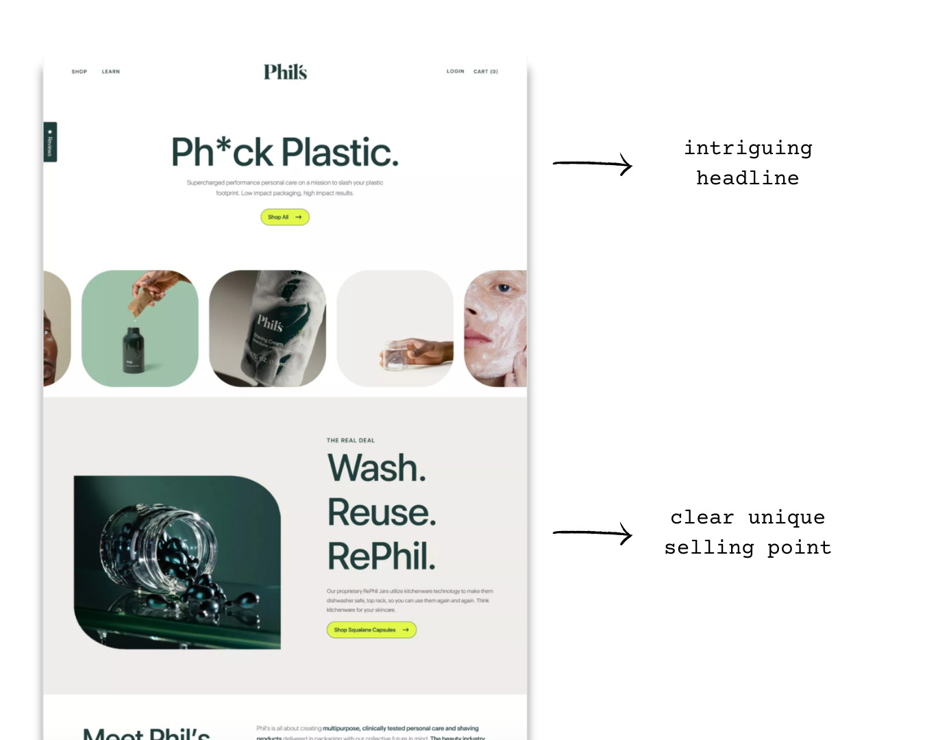
1. Your page lacks a Unique Selling Point (USP)
You started your website without a clear purpose or strategy. Without a USP, your site is just another face in the crowded digital crowd.
Stand out by clearly communicating what makes you unique and why customers should choose you over the competition.
Phil’s is clear on their USP. They articulate clearly their “proprietary RePhil Jars utilize kitchenware technology to make them dishwasher safe, top rack, so you can use them again and again. Think kitchenware for your skincare,” so you instantly know what’s unique about them.
2. You lead with your designer’s ego rather than business needs
I see this everywhere on X, YouTube, Instagram, you name it. I’ll see them posting their client work, asking their followers what they think about their ‘over-beautified’ designs for their clients.
While some designs are really nice, most of them just don’t fit the business context.
Do clients want the page to be aligned with their business goals?
Do clients want to communicate their brand message efficiently?
Do clients want to convert leads into customers?
They probably want all. And that’s what they need you for.
A website should be designed with your business and customers in mind, not as a showcase for artistic flair.
Ensure your design aligns with your objectives and appeals to your audience.
3. Your copy doesn’t match your target audience
“Don’t find customers for your products, find products for your customers.” — Seth Goldin
Your website’s design and content should resonate with your target audience. If neon colors and flashy graphics aren’t what your customers appreciate, you’re driving them away.
Understand your audience’s preferences first, then tell them why they need your product.
You can access your Direct Voice of Customers (DVOC) through feedback forms, surveys, interviews, and focus groups and Indirect Voice of Customers (IVOC) through social media, reviews, forums, and comments.
Joanna Wiebe from CopyHackers pointed out, “The more you make your voice, their voice, the more likely, you are to actually find a way into a conversation with them…And again, you are going to turn your brand voice into their voice, you are their advocate, you are what they buy into, and also buy.”
Tailor your site to meet their needs and tastes.
4. You have an outdated blog content
A blog that hasn’t been updated since 2008 sends a clear message: you’re out of touch.
Regularly update your blog with fresh, relevant content to show that your business is active and engaged. It doesn’t take long. If you want to be seen as an expert in your industry, this is what you need to do.
A well-maintained blog can attract new visitors and keep existing ones coming back.
5. Your page is all about you
Many businesses make the mistake of centering their website around their own achievements, services, and accolades.
While it’s important to establish credibility, the primary focus should be on the customer.
If your site is all about you, it’s time to refocus.
Customers visit your site with specific needs and questions, and they want to know how you can help them.
As Simon Sinek famously said, “People don’t buy what you do; they buy why you do it and what you do simply proves what you believe.”
This means your website should clearly communicate why your services matter to your customers and how you can solve their problems.
6. You spent $5k on a designer with a 10-cent copywriting skill
“If it doesn’t sell, it isn’t creative.” — David Ogilvy
You might have spent thousands on a sleek design but skimped on quality copywriting. Good design catches the eye, but it’s compelling copy that seals the deal.
If the accompanying copy is subpar, the overall effectiveness of your site diminishes significantly.
Invest more time into writing persuasively rather than beautifying and perfecting the visuals of your website.
7. You’re trying to close too soon
Don’t expect to close the deal on the first visit. Building a relationship with your visitors takes time.
“When you walk into an expensive watch store, an expert sales agent helps you find the perfect watch. Your website should do the same.”
Guide them through the process with clear calls-to-action and valuable content that nurtures them along the journey until they’re ready to commit.
Conclusion
You can transform your website from a lead-sucking vacuum into a powerful sales machine simply by avoiding these seven deadly sins.
At Designlabb, we always remind them to focus on strategy, design for their audience, keep their content fresh, and invest in quality copywriting.
Most importantly, build good relationships rather than pushing for an immediate sale because websites can be a 24/7 salesperson — make sure it’s working for you, not against you.
I’ve just given you the top 7 things you need to avoid when building out your website. Some issues may be minor but can play a big factor that will influence your prospects’ decisions.
Always keep your customers in mind and serve them like how you want to be served. Just like in airplanes and hotels — they have expectations!
Did I miss anything out? Leave us a comment below or shoot me an email at alvis@designlabb.cc.
©2024 Designlabb