
The power of subtraction
What can we remove?

(Designlabb) -- We tend to think that adding more is always better — more rules, more processes, more code, more features. But this approach creates tangled systems that eventually choke on their own complexity.
Without trimming back, these systems grow uncontrollably until they inevitably collapse — first gradually, then all at once.
A post on Reddit caught my attention.
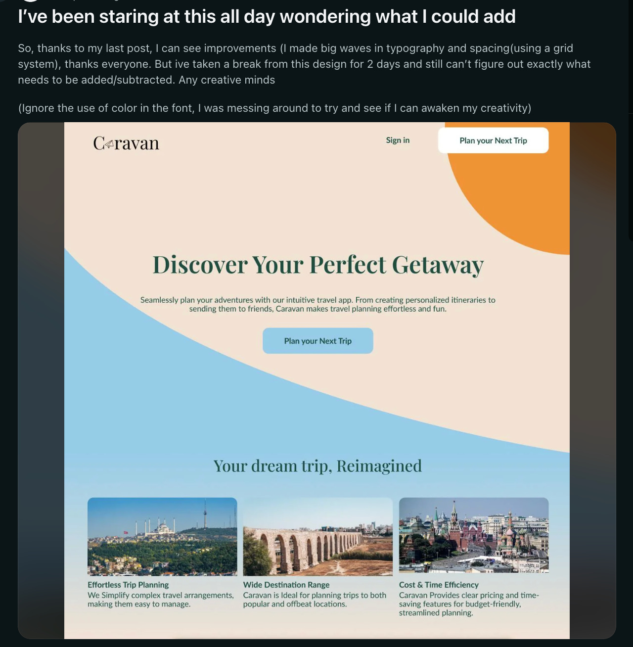
“I’ve been staring at this all day wondering what I could add
So, thanks to my last post, I can see improvements (I made big waves in typography and spacing(using a grid system), thanks everyone. But ive taken a break from this design for 2 days and still can’t figure out exactly what needs to be added/subtracted. Any creative minds
(Ignore the use of color in the font, I was messing around to try and see if I can awaken my creativity)”
Here’s my quick answer:
“The hero could use some scenery pics.
Usually, as designers, we think of functional elements first then we cut from there. Because oftentimes we want to add more and more elements, but ends up diluting the impact of the landing page.
I don’t think you need to add anything, just how things are structured and presented.”
Think of a system like a piece of trash on a beach. If one piece of litter blows across the sand, it’s easy to pick up and keep the beach clean for the next person. But if the whole beach is covered in garbage, it feels overwhelming — and we just accept it as normal.
A good system needs regular clean-ups to stay healthy. Without this, we end up slapping on temporary fixes until the whole thing is so messy that the only solution is to tear it down and start over.
So, why is adding stuff easier than taking it away? Maybe it’s because we like to show off what we’ve built, not what we’ve removed. But there’s a difference between meaningful additions and the clutter that just weighs us down.
We should remember those who do the unseen work of clearing away the clutter. Their contribution isn’t about building flashy things, but about preserving the simplicity and beauty of what already exists.
This is the same for your landing page.
In the end, simplicity is a powerful design choice, often overlooked in favor of flashy additions. A landing page, like any system, thrives when it’s clean, purposeful, and free of unnecessary clutter.
The real challenge lies not in adding more, but in knowing what to take away, ensuring every element serves a distinct purpose. As designers, we should embrace the subtle art of subtraction and focus on clarity and impact.
The goal isn’t to show how much we can build, but how effectively we can communicate with what’s essential.
Less truly can be more.
Did I miss anything out? Leave us a comment below or shoot me an email at alvis@designlabb.cc.
©2024 Designlabb